How to Spot Advocacy Science: John Taylor Edition
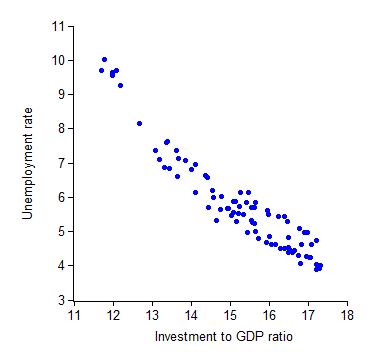
Sometimes you see the perfect piece of evidence. The scatter plot that is just so. The data line up perfectly. And then you realize, perhaps they’re just too perfect. What you are seeing is advocacy, dressed up as science. Here’s an example, provided by John Taylor (via Greg Mankiw):

Taylor’s conclusion:
The data on spending shares show that the most effective way to reduce unemployment is to raise investment as a share of GDP.
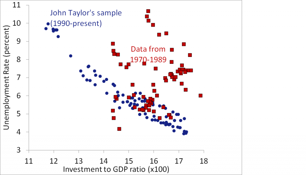
But why begin the scatter plot in 1990? There’s no good reason. In fact, most folks typically download the entire history of available macro data. So let’s see what happens if we extend it back to, say, 1970:

Hmm… What conclusions should we draw about this relationship? And now why do you think Taylor began his sample in 1990?
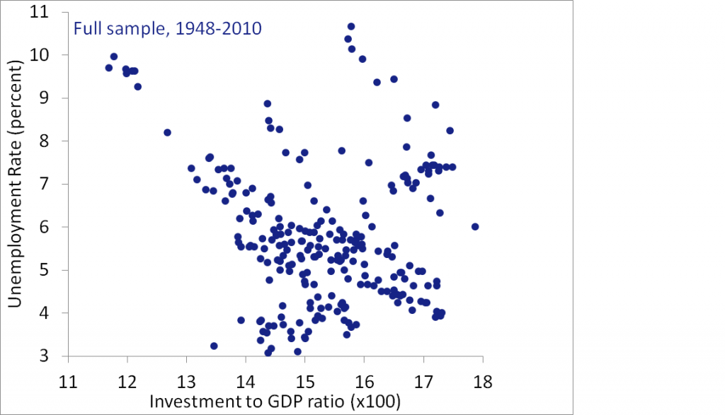
Actually, we should use all the available data. The chart below goes back to 1948, when these series—in their current form—began:

Now what’s your conclusion?
Here’s Mankiw’s assessment of Taylor’s claim:
There’s no doubt that the strength of the correlation is impressive.
But when you look beyond the cherry-picked sample, the correlation is a decidedly unimpressive -0.14.
Here’s my conclusion: On balance, times in which the investment share is higher, are slightly more likely to be good times. But I’m not sure why. Is it—as Taylor asserts—that high investment shares create good times? Or is it that good times encourage investment? Or is it a third factor—perhaps in good times the government doesn’t need to prime the fiscal pump, and so the investment share is higher? Or is it something else?
Be wary of economists wielding short samples.


Comments